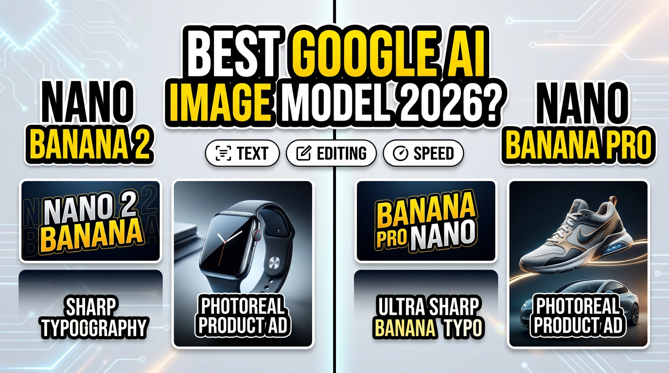
If you’re choosing between Nano Banana 2 and Nano Banana Pro, here’s the honest truth: both are top-tier Google image models, but they’re optimized for different kinds of work. One is built for fast, high-throughput creation and editing; the other leans into deeper reasoning and maximum precision on difficult prompts.
Quick answer: What’s the difference between Nano Banana 2 and Nano Banana Pro?
- Nano Banana 2 (Gemini Flash Image): optimized for speed and fast iteration while staying close to “Pro-level” quality for many everyday use cases.
- Nano Banana Pro (Gemini Pro Image): optimized for maximum reasoning depth and precision—especially on complex layouts, heavy instruction prompts, and tricky multi-step edits.
- Both: strong realism, strong text rendering compared to older generations, and powerful editing that can preserve identity, lighting, and composition when prompted correctly.
Access Nano Banana 2 and Nano Banana Pro
Nano Banana 2 and Nano Banana Pro are available on GenAIntel so you can generate side-by-side comparisons with the exact same prompts and references.
Benchmarks: Prompts that reveal differences
Below are five high-signal benchmarks. Each includes one prompt and two result slots—one for Nano Banana 2 and one for Nano Banana Pro. Replace the placeholder URLs with your generated outputs.
Benchmark 1: Multi-reference compositing
If your platform supports multiple reference images, this is a high-signal test. Use a style reference (Image 1), a subject reference (Image 2), and a product reference (Image 3), then run the same instruction on both models.
Use Image 1 as the style reference (clean premium studio look). Use Image 2 as the subject reference (person identity). Use Image 3 as the product reference (handheld object). Generate a photoreal 16:9 scene: the subject from Image 2 holds the product from Image 3 in their right hand, standing in a studio environment that matches Image 1 lighting and color. Preserve the subject’s face and hairstyle. Keep the product shape and logo placement consistent. Add a soft rim light and shallow depth of field. No extra text.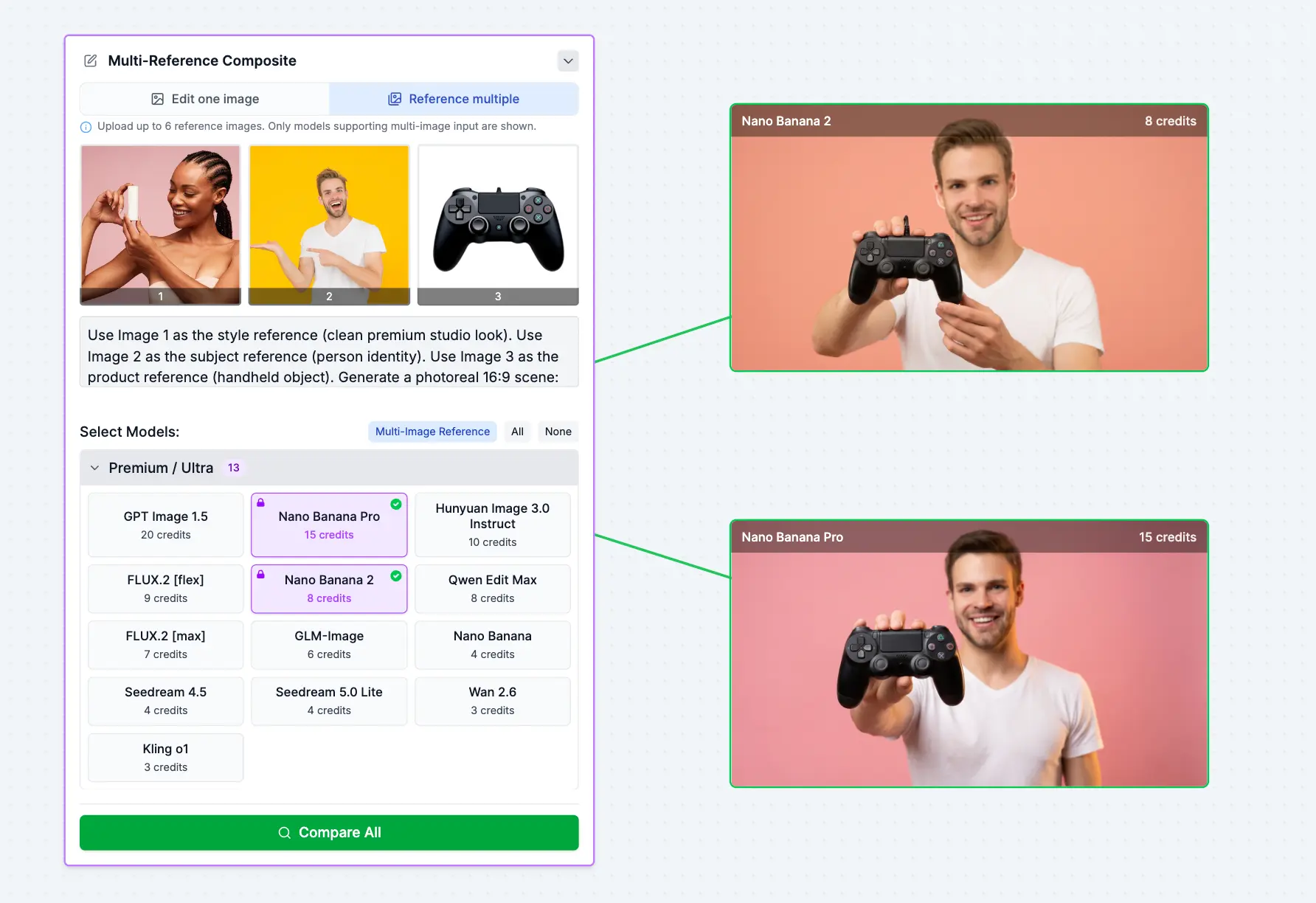


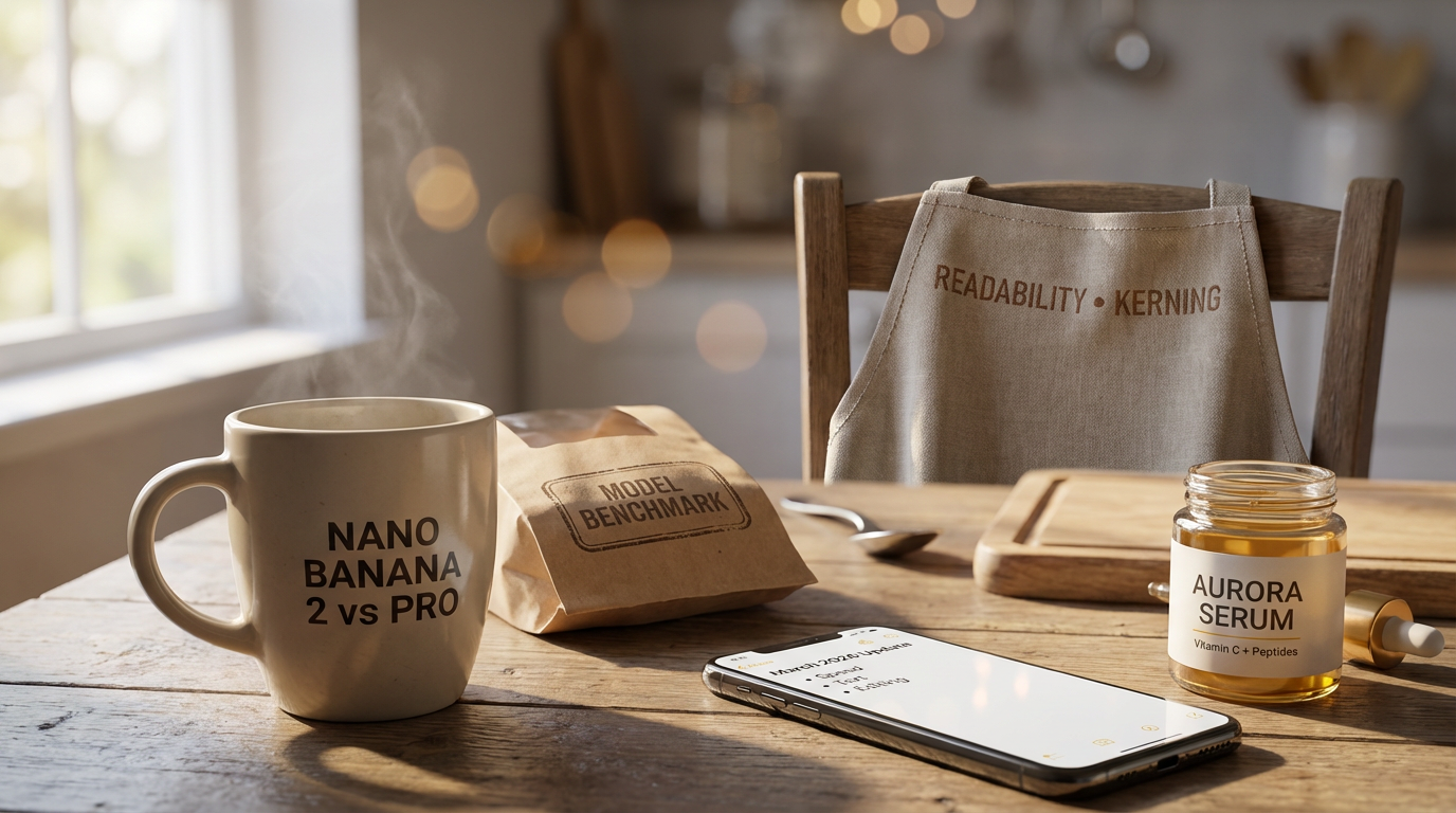
Benchmark 2: Typography stress test
Landscape 16:9 photoreal daily-life scene designed to stress-test text rendering on multiple challenging surfaces (curved, glossy, fabric, glass). A cozy kitchen table in morning window light with realistic shadows and shallow depth of field.

Include these objects and make ALL text perfectly readable, correctly spelled, and naturally printed on the surfaces (no gibberish, no warped letters):

1) A curved ceramic coffee mug with text: "NANO BANANA 2 vs PRO"
2) A small paper bakery bag with a stamp-style label: "MODEL BENCHMARK"
3) A smartphone on the table showing a clean note app with headline: "March 2026 Update" and three bullet lines: "Speed" • "Text" • "Editing"
4) A glass jar label (slightly glossy) reading: "AURORA SERUM" with smaller line: "Vitamin C + Peptides"
5) A fabric apron hanging on a chair with stitched text: "READABILITY • KERNING"

Background details: a cutting board, a spoon, soft bokeh lights, subtle steam from coffee. Natural textures, realistic materials, crisp focus on the text surfaces. No extra text anywhere. Perfect spelling and legibility on every object.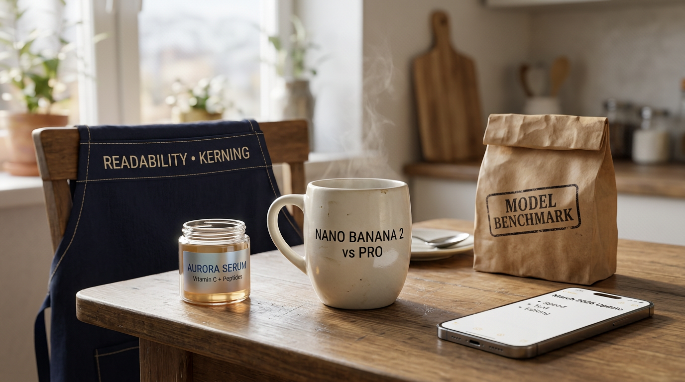
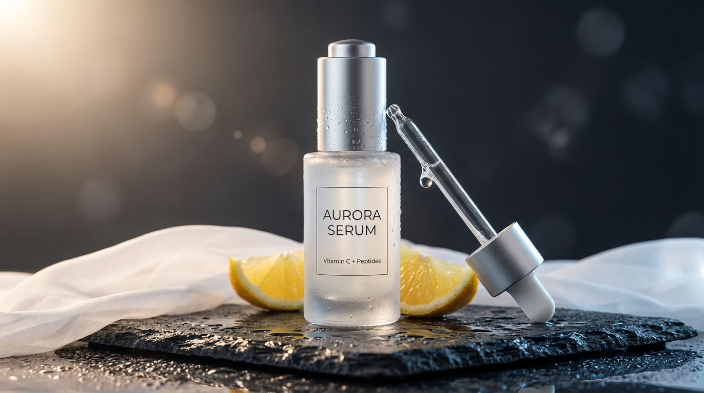
Benchmark 3: Premium product ad
Ultra-photoreal 16:9 luxury skincare advertisement scene on a styled set. Foreground: a frosted glass serum bottle with a brushed aluminum cap, tiny condensation droplets, label text clearly readable: "AURORA SERUM" and smaller line "Vitamin C + Peptides" in clean sans-serif. The bottle stands on a wet dark slate stone with realistic water beads and subtle reflections. Props: sliced citrus wedge, a glass pipette with a droplet mid-air (freeze-frame), translucent fabric draped behind. Lighting: soft key light upper-left, cool rim light right, gentle backlight through frosted glass, subtle caustics on slate. Background: deep charcoal gradient with faint bokeh. 85mm lens look, shallow depth of field, crisp focus on label and droplets, premium commercial style, perfect spelling.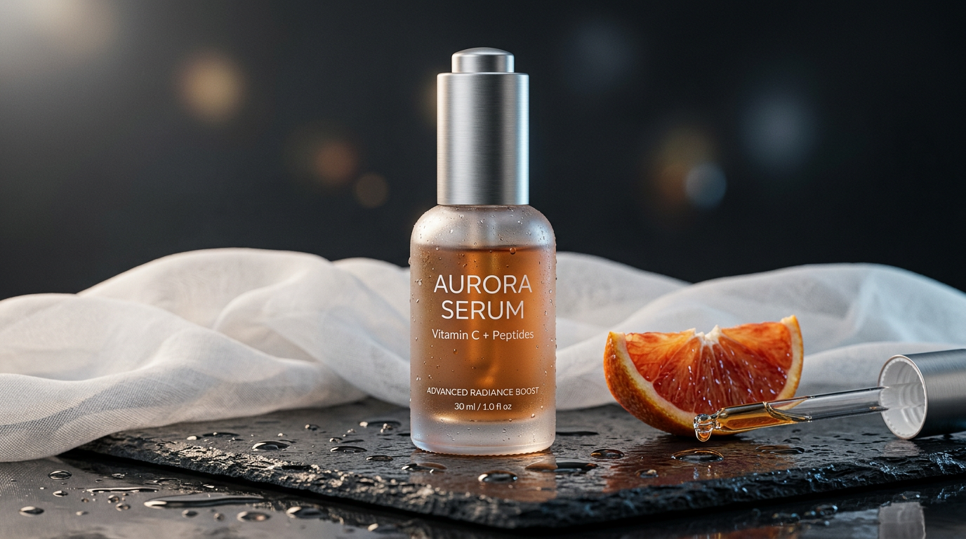
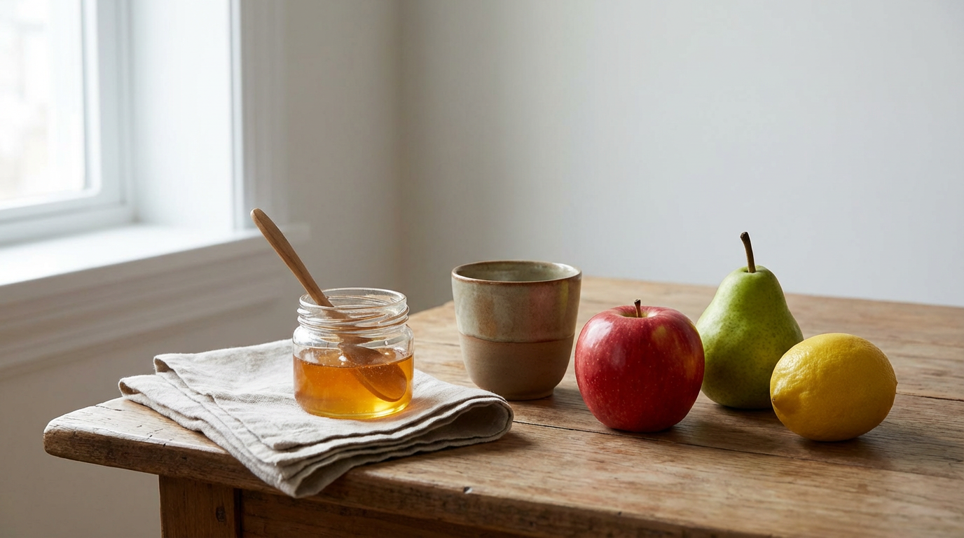
Benchmark 4: Instruction-heavy scene
Photoreal tabletop still life, 16:9. Exactly 7 objects arranged neatly: 1 red apple, 1 green pear, 1 lemon, 1 small glass jar of honey, 1 wooden spoon, 1 folded linen napkin, 1 ceramic cup. Soft window light from the left, natural shadows, shallow depth of field, clean background. No extra objects, no text, no additional fruit.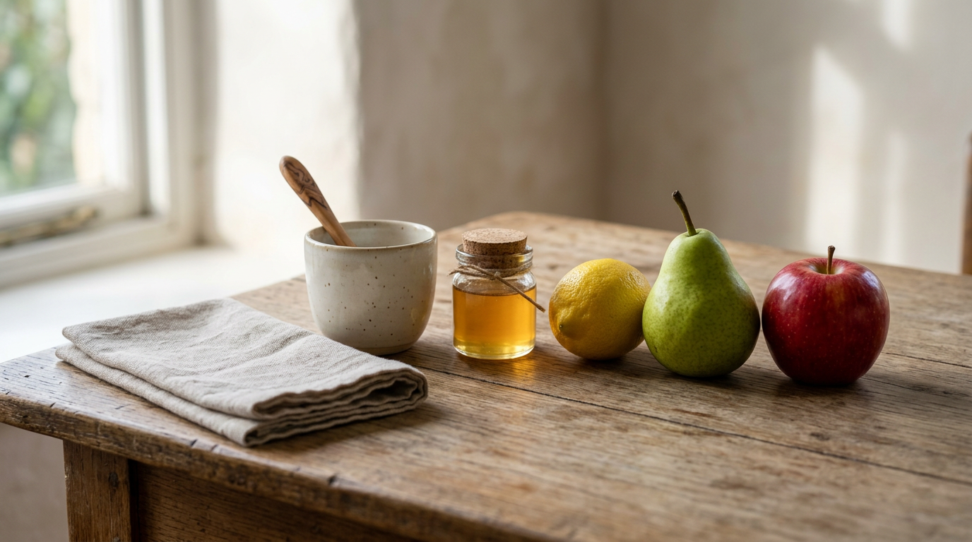
Benchmark 5: Semantic editing
This benchmark is an editing test. Use the same base image for both models.
Photoreal portrait of an adult (25+) standing in a bright living room, wearing a plain denim jacket, natural daylight from a window, neutral background, 16:9.
Keep the person’s face, hair, skin tone, pose, and background unchanged. Change the jacket to a tailored beige trench coat with realistic fabric texture and natural folds. Add bright sunlight coming in from the window, and adapt the lighting accordingly on the right side of the woman.

When to use Nano Banana 2
Nano Banana 2 is the better default when you care about speed and iteration. It’s ideal for creators and teams who need many variations quickly: marketing drafts, e-commerce variants, social creatives, concept exploration, and rapid edit loops.
- High-volume creation: generate many options and pick winners.
- Fast editing cycles: adjust one detail, rerun, repeat.
- Vibrant look out-of-the-box: punchy contrast and consistent fidelity.
- Multi-reference compositing workflows (when your platform supports multiple references).
When to use Nano Banana Pro
Nano Banana Pro is the better choice when prompts are complex or the result must be extremely precise. It’s often preferred when you need the cleanest structure, best long-text stability, and careful handling of multi-step edits.
- Complex instruction prompts that include many constraints.
- High-stakes typography: long paragraphs, multilingual layouts, dense UI/infographic text.
- Hard edits where identity and scene geometry must remain stable.
- Detailed compositions with many interacting objects.
How to benchmark them fairly
A fair benchmark uses the same prompt (and the same reference images, if applicable) across both models. The goal isn’t to “prove a winner,” but to understand which model is more reliable for your actual workflow.
- Keep the prompt identical for both models.
- Avoid overly long prompts at first; add constraints progressively.
- For editing tests, lock what must not change (identity, pose, camera angle).
- For typography tests, include exact text in quotes and demand perfect spelling.
Make this a repeatable benchmark
Save these prompts as a benchmark set, then re-run them whenever models update—so you always know what’s best for your workflow.
Verdict: which one should you pick?
For most creators in March 2026, the best strategy is simple: use Nano Banana 2 as your fast default, then switch to Nano Banana Pro when a prompt is especially complex or when you need maximum precision. If you’re doing brand pipelines and production-style design, it’s also worth comparing against similar-quality models like Flux 2 to see which output best matches your aesthetic.