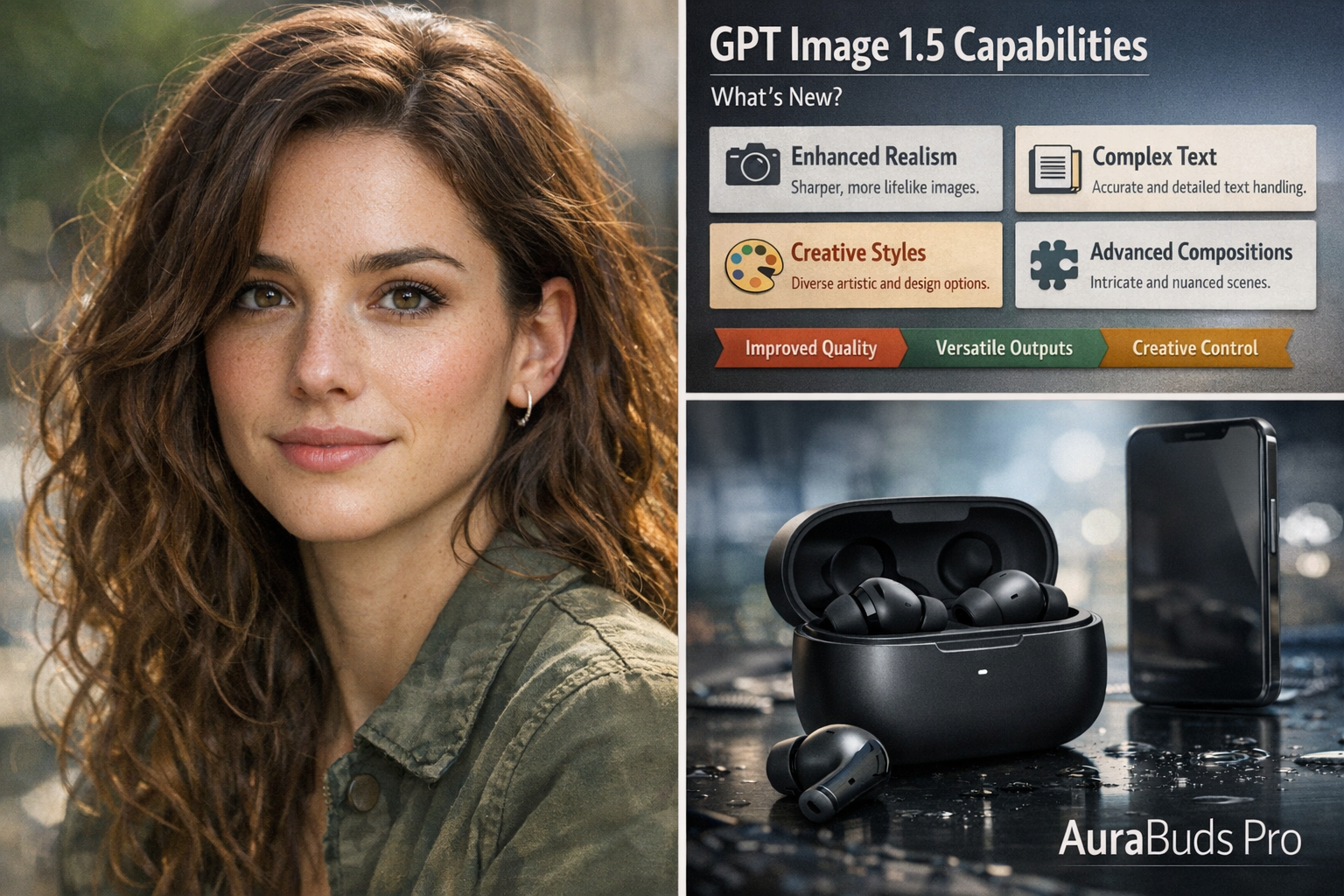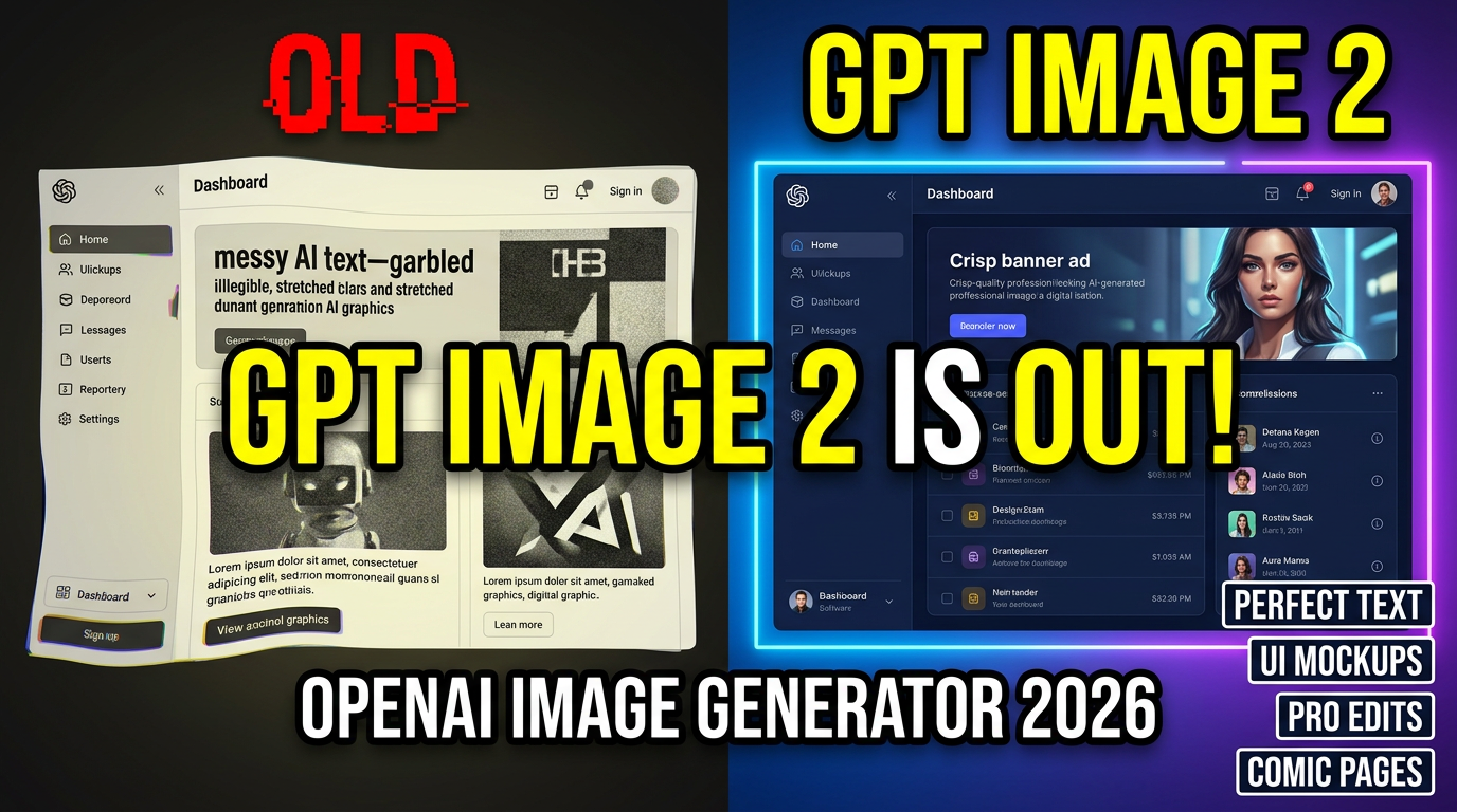
GPT Image 2 is OpenAI’s newest image model, and it’s built for the things creators and teams actually struggle with: clean text inside images, stronger instruction-following, realistic details, and edits that don’t accidentally change everything else. If you create marketing graphics, product mockups, UI screens, or story-driven visuals, this release is a big deal.
GPT Image 2 is available on GenAIntel, so you can try it on day 0 and compare outputs against other top models in the same workspace.
Try GPT Image 2 on GenAIntel
Generate and edit images with GPT Image 2, then compare results with other models side-by-side for the fastest workflow.
What is GPT Image 2?
GPT Image 2 is the image model behind OpenAI’s ChatGPT Images 2.0 experience. It’s designed for high-fidelity image creation and context-aware image editing, especially where precision matters (typography, layouts, realistic scenes, and preserving identity during edits).
If you want the official overview of the release, see OpenAI: Introducing ChatGPT Images 2.0.
What GPT Image 2 is best at
- Text rendering that’s actually usable: Posters, packaging labels, menus, UI labels, and multi-line typography tend to come out cleaner and more readable than previous generations.
- Instruction-following and layout control: Better at “do exactly this” prompts, grids, spacing, hierarchy, and structured composition.
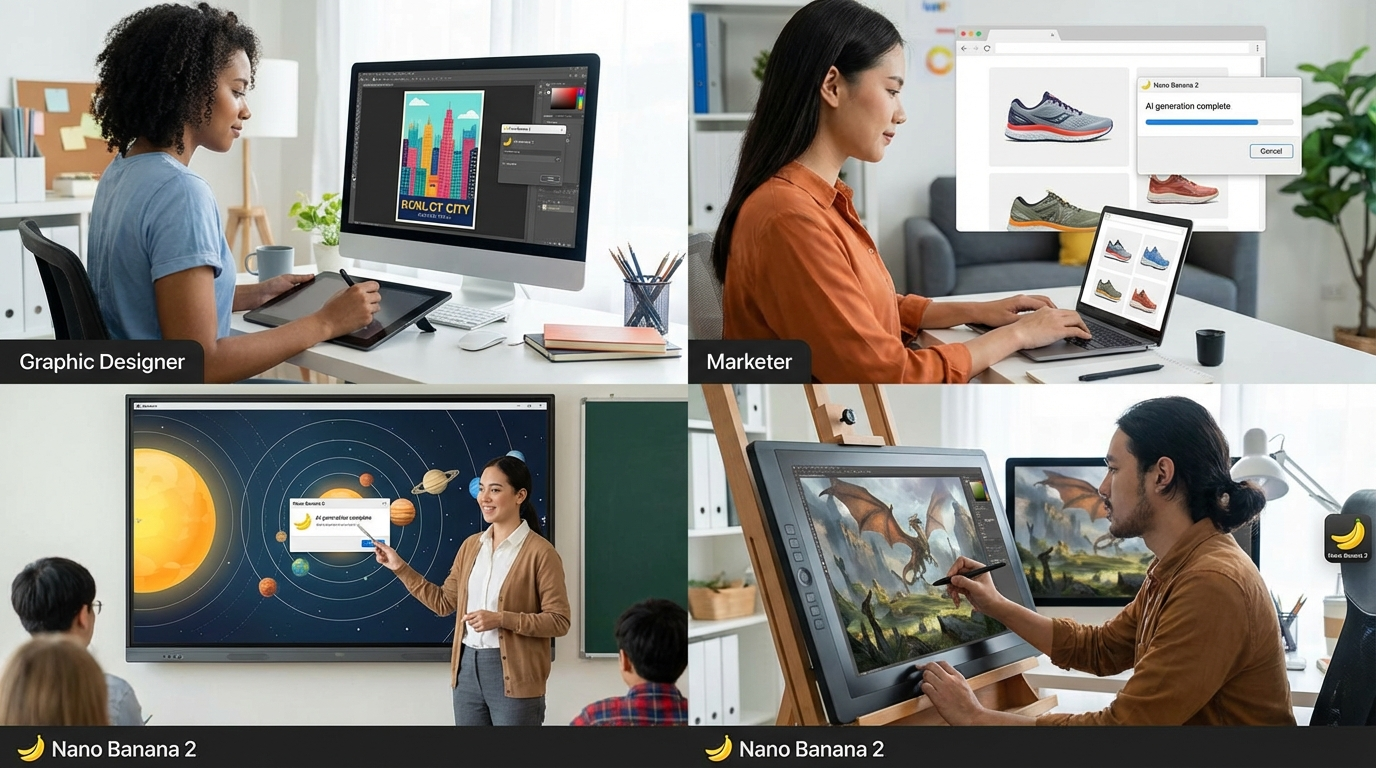
- Design + marketing assets: Great fit for banners, ads, product shots, social creatives, and thumbnails where text must be correct.
- UI mockups and screenshot-style visuals: Strong for app screens and clean interface compositions when you specify layout and copy precisely.
- Consistent multi-image sets: Better continuity across a set of images (character sheets, comic pages, multi-panel sequences, or variant design iterations).
- Precise image editing: More reliable at changing one thing while preserving identity, lighting direction, and composition.
4 prompt examples that showcase GPT Image 2’s strengths
Example 1: 4-panel comic page (consistent characters + readable lettering)
Create a single 16:9 image that contains a 4-panel indie comic page (2 panels top row, 2 panels bottom row). Keep the same two characters consistent across all panels: Character A is a woman with short curly hair wearing a denim jacket; Character B is a man with straight hair wearing a beige hoodie. Setting: cozy café at dusk.

Panel 1: wide shot, both sitting with coffee. Speech bubble A: "We always say we'll start tomorrow."
Panel 2: close-up on B, thoughtful. Speech bubble B: "What if we start small today?"
Panel 3: close-up on A, slight smile. Speech bubble A: "Like… five minutes?"
Panel 4: medium shot, both laughing. Speech bubble B: "Five minutes. Right now."

Style: modern indie comic, clean linework, soft colors, cinematic lighting, readable speech bubbles, no misspellings, no extra text.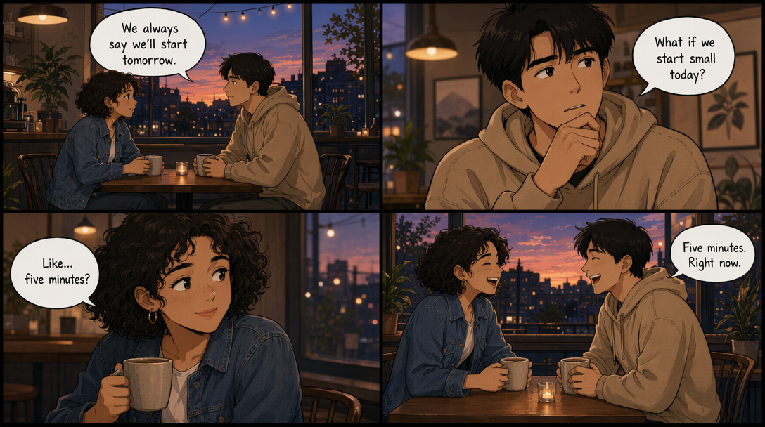
Example 2: Realistic macOS laptop screenshot (Chrome + accurate UI + readable text)
Ultra-photoreal 16:9 image of a modern MacBook Pro on a clean desk (wood surface), shot like a real photo. The laptop screen shows macOS with Google Chrome open in the foreground. Make it look like a genuine screenshot photographed in real life: correct macOS menu bar at the top, macOS window controls (red/yellow/green) on the Chrome window, realistic reflections on the screen.

Chrome details: 3 visible tabs with readable titles: "GenAIntel Guides" | "GPT Image 2" | "Prompt Library". Address bar shows a readable URL: "https://genaintel.com/guides".

The webpage displayed is a clean guide page with a hero banner and readable headline text: "GPT Image 2: Prompt Examples" and subheadline: "Text • Layout • Consistency". Include a left sidebar with 4 items (readable): "Overview" "Examples" "FAQ" "Compare".

On the desk next to the laptop: a coffee mug and a small notebook. Lighting: soft daylight from the left, realistic shadows, crisp detail. No extra random text anywhere, all UI text must be perfectly readable, correctly spelled, aligned, and not distorted.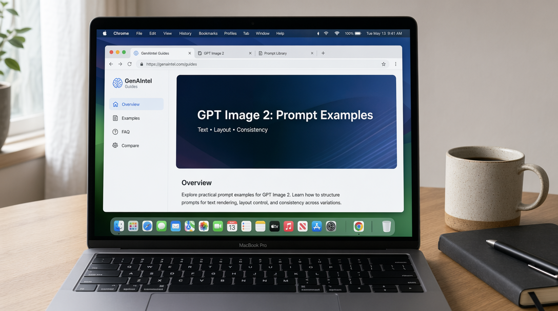
Example 3: Real-life typography stress test (text on difficult surfaces)
Landscape 16:9 photoreal daily-life scene designed to stress-test text rendering on multiple challenging surfaces (curved, glossy, fabric, glass). A cozy kitchen table in morning window light with realistic shadows and shallow depth of field.

Include these objects and make ALL text perfectly readable, correctly spelled, and naturally printed on the surfaces (no gibberish, no warped letters):

1) A curved ceramic coffee mug with text: "GPT IMAGE 2"
2) A small paper bakery bag with a stamp-style label: "TEXT RENDERING TEST"
3) A smartphone on the table showing a clean note app with headline: "April 2026 Update" and three bullet lines: "Typography" • "UI" • "Editing"
4) A glass jar label (slightly glossy) reading: "AURORA SERUM" with smaller line: "Vitamin C + Peptides"
5) A fabric apron hanging on a chair with stitched text: "READABILITY • KERNING"

Background details: a cutting board, a spoon, soft bokeh lights, subtle steam from coffee. Natural textures, realistic materials, crisp focus on the text surfaces. No extra text anywhere. Perfect spelling and legibility on every object.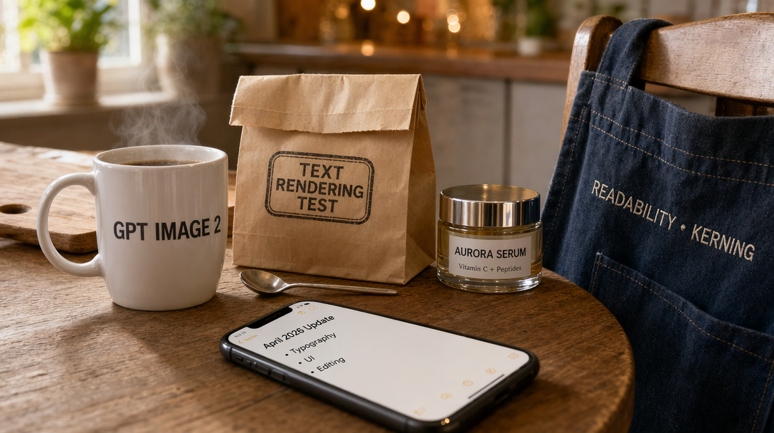
Example 4: 16:9 website hero + dashboard (layout control + readable microcopy)
Create a single 16:9 screenshot-style image of a modern SaaS website landing page (desktop). Clean white background, subtle shadows, consistent spacing, professional design. Top navigation bar items (exact text): "Product" "Pricing" "Docs" "Blog" "Sign In" and a button labeled "Get Started".

Hero section headline (exact): "Ship Better Designs, Faster".
Subheadline (exact): "AI-powered mockups, templates, and brand kits in one workspace.".
Two CTA buttons under the subheadline (exact): "Start Free" and "View Demo".

Right side of the hero shows a dashboard preview card titled "Analytics" with three metrics (exact): "Visitors 48.2K" "Conversion 3.4%" "Revenue $12,980".
Below the dashboard preview, include 3 feature chips (exact): "Clean Typography" "Layout Control" "Precise Edits".

All text must be perfectly readable, correctly spelled, aligned, and crisp. No extra text, no random icons, no gibberish.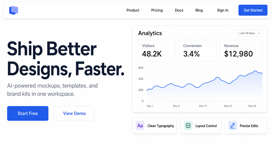
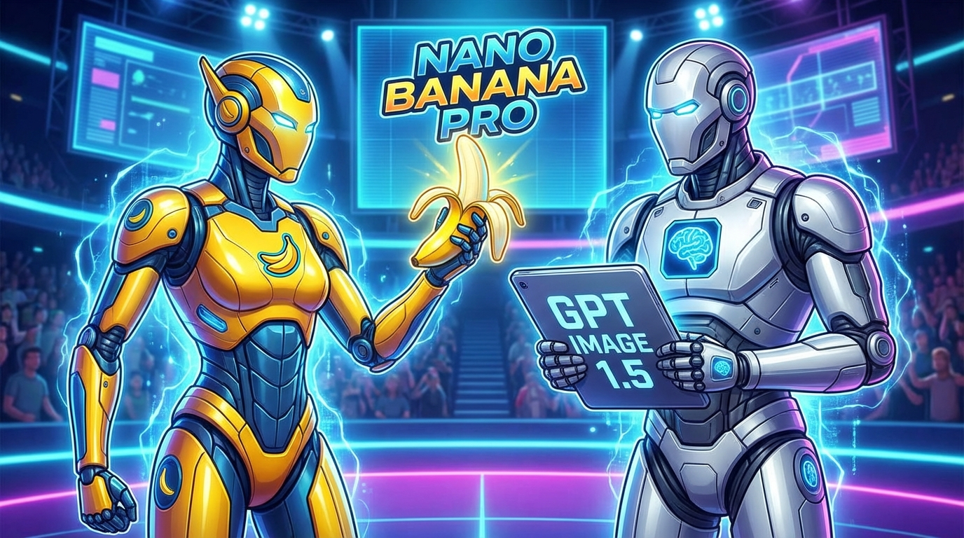
GPT Image 2 vs Google Nano Banana Pro: the SOTA race is on
Right now, GPT Image 2 and Google’s Nano Banana Pro are shaping up as two of the most talked-about contenders for the “best image model” title. They overlap heavily on the most valuable tasks: realistic images, reliable text rendering, and high-precision, instruction-based changes. In practice, many teams will treat them as complementary: one might win on design-heavy typography and UI-like visuals, while the other may shine on certain editing workflows or aesthetic preferences.
If you create marketing assets or UI-like visuals regularly, it’s worth benchmarking both with the same prompts and picking the model that’s most consistent for your specific templates and brand look.
Build a repeatable benchmark pack
Save these prompts as a reusable test set so you can compare GPT Image 2 and Nano Banana Pro on your real use cases anytime.
FAQ
What is GPT Image 2?
GPT Image 2 is OpenAI’s newest image model behind ChatGPT Images 2.0, focused on high-fidelity image creation and precision image editing.
What are the best use cases for GPT Image 2?
GPT Image 2 is especially strong for visuals where accuracy matters: readable text in images, structured layouts (banners, posters, landing pages), UI mockups, comics with readable dialogue, and edits that preserve identity and scene coherence.
How do I get perfect text rendering with GPT Image 2?
Use exact copy in quotes, keep the amount of text reasonable, specify where the text should appear (header, subtitle, buttons), and explicitly demand “perfect spelling, crisp readable text, no distortions.” If you need dense text, break it into fewer lines and increase spacing requirements.
Can GPT Image 2 generate realistic screenshots or UI-like images?
Yes. Screenshot-style prompts with explicit UI details (menus, tabs, button labels, spacing rules) are a strong fit, especially in 16:9 for desktop-style layouts. The key is being explicit about exact text and preventing extra random text.
Does GPT Image 2 support consistent characters across multiple images?
It’s one of the better models for consistent multi-image sets, especially when you use a fixed character description and keep clothing/hair/face details identical across prompts. For best results, reuse the exact same character paragraph and only change the scene details.
What image size should I use for GPT Image 2 prompts?
Choose the aspect ratio based on where the image will live. 16:9 is ideal for YouTube thumbnails, website hero banners, desktop UI mockups, and presentation-style visuals. For square posts, use 1:1; for vertical content, use 9:16.
GPT Image 2 vs Nano Banana Pro: which one is better?
They’re both competing at the top end. If your work depends on typography, layout precision, and design-like outputs, GPT Image 2 is a strong pick. Nano Banana Pro is also a top contender and may be preferred for certain editing workflows or stylistic preferences. The fastest way to decide is to benchmark both with your own templates.
Where can I read the official announcement?
OpenAI’s release page is here: Introducing ChatGPT Images 2.0.